1. The release of a new design should be based on users' feedback
In the traditional google culture, any design decision should be based on statistics from users' feedback. When they want to test a new feature, they first make it available to a small group of users. In the test phase, there is usually an option that enables you to SWITCH BACK easily. Therefore if most users keeps the new feature, it suggests users like the new feature, and then the engineers make it accessible to a more general group of users. It is like mutation and selection in biology as described by Darwin. If you remember the history that gmail kept the Beta label for five years: this is the right altitude.
But this time the gmail team IMPOSE the new interface to users. Even worse, if you do not like it, you can not switch back. My personal observation is that there is something wrong with the Google's culture and they become very arrogrant. Maybe you still remember the initial release of Buzz.
2. The Big Ugly Useless "Compose mail" Button
One of the revolutionary feature of gmail is the use of keyboard shortcut in a webmail. When you want to create a new mail, you instinctively press c in the keyboard and who bother moving figures away to the mouse?
3. The Contacts Interface that Clutters the Sidebar
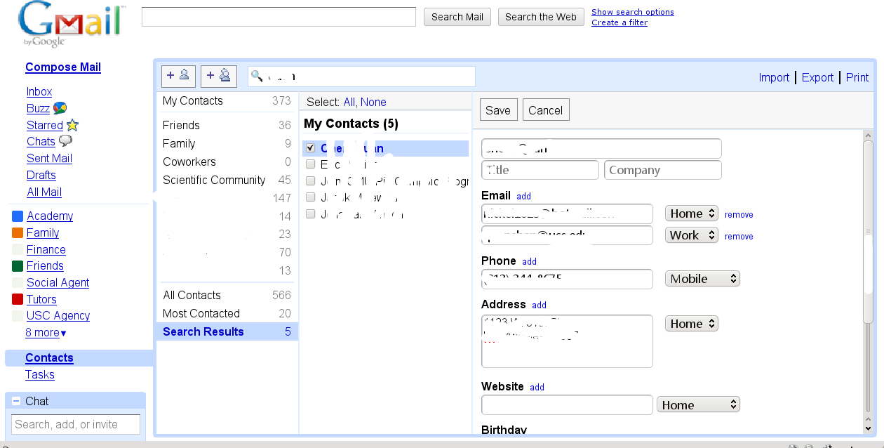
I like the search functionality in the old interface so much that I can not like anything in the new design. It feels cool to use it when you see dynamically updated result when you type in your search keywords. But in the new interface, the google team seems forgetting the word "SEARCH", instead they use the old style of ordered list of contacts. When you have hundreds of contacts, you can bear to turn twenty pages of lists of contacts? The old 3 column view makes full use of screen but the new sidebar design simply clutter the sidebar. In my opinion, the sidebar is where most used links that are fixed so that you are able to easily find the right link. When there are tens of entries there, it is disaster. Finally let's come to individual's column, in the new design, the big note box occupies half of the screen. Fairly speaking this is not terribly wrong. But you just want to find a peron's phone or email, why should we leave half of your screen blank. What's more, in the old interface, there is a link to either write a mail to the individual or call him or her. But how could you do that quickly in the new one. If you have not feel what I say, go to Google Voice's contact interface before they ruin it as well.
4. Pop-up style of Task List

Again this is about the full use of wide screen display.
If this post make sense to you, please go to leave a post at Gmail Help Forum and make the voice of us heard.
